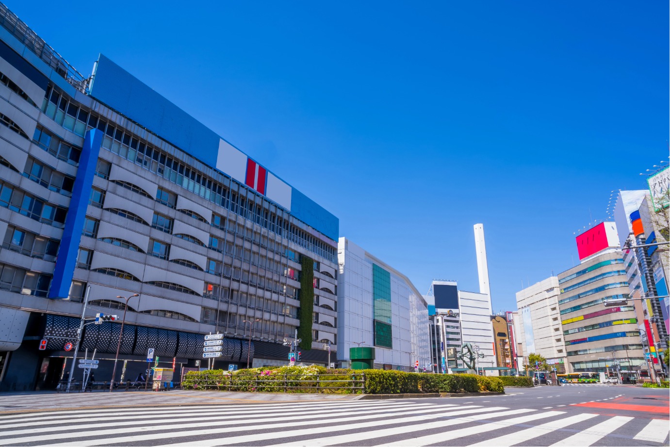
新宿区
新宿・神乐坂・高田马场
查看新宿区
AREA GUIDE
从东京的人气区域中,查找餐厅、设施和活动信息。
EDITOR'S SELECTION
从“畅游东京”编辑部亲自到访,并实际体验过料理与用餐环境的店铺中,按不同主题为您精选推荐。
※刊登内容根据编辑部到访时的信息整理而成。
池上本门寺 御会式 在日莲宗大本山・池上本门寺,将举办以日莲圣人的忌日为中心的法要活动“御会式(おえしき)”。2026年适逢宗祖第七百四十五远忌。 除法要与法话外,还将举行为池上街区增色的“万灯练供养”,以及追思日莲圣人圆寂的“临灭度时法要”等。这是在与日莲圣人有渊源的圣迹中体验传统佛教行事的机会。 御会式看点 行走池上街区的万灯练供养 10月12日,将从池上德持会馆到池上本门寺,举行约2公里的万灯练行列。 来自全国各地的讲中抬着上百座万灯,伴随纏、团扇太鼓、钲、笛的声响,在池上的街道穿行。以纸花装饰的万灯,源自传说:在日莲圣人圆寂之时,庭前的樱树逆季开花。 庄严的临灭度时法要 10月13日早上7点起,将举行“特别说法・临灭度时法要”。 仿效据传在日莲圣人圆寂之际由日昭圣人敲响的钟,池上本门寺的贯首将安静地敲响“临灭度时之钟”。 法要・法话与团体参拜 御会式期间将举行各种法要与法话。10月12日上午10点,将举行把日莲圣人的御衣由夏装更换为冬装的“宗祖御更衣法要”,下午2点举行“宗祖报恩御逮夜法要”。 此外,自12日起,大殿中回荡着题目的声音,来自全国的众多参拜者与团体参拜者将陆续到访。 也将进行直播 万灯练供养与临灭度时法要预计将在互联网上进行直播。无法前往现场的访客也可通过官方网站观看活动情况。 参拜时的注意事项 在御会式期间,池上本门寺及池上站周边将实施交通管制。除对汽车的进入与通行进行限制外,也建议避免骑自行车前往参拜。 此外,在本门寺境内以及万灯游行队列区域,禁止使用无人机等无线操控的飞行物。由于交通管制与引导内容可能发生变更,请遵从当地警察与引导人员的指示。 各种万灯 © 池上本门寺 纏 © 池上本门寺 ※有关活动时间、交通管制、直播等详情,请在来访前查看官方网站。 ※目前因配合日莲大圣人第750远忌项目,正在进行大堂的修缮工程。 :root { --bg-color: #fcfcfc; --card-bg: #ffffff; --text-main: #111111; --text-muted: #555555; --accent-orange: #ff5500; --accent-orange-light: #fff2ec; --border-color: #e5e5e5; --dark-card: #141414; } * { box-sizing: border-box; margin: 0; padding: 0; } html, body { width: 100%; overflow-x: hidden; background-color: var(--bg-color); color: var(--text-main); font-family: 'Noto Sans JP', 'Noto Sans', -apple-system, BlinkMacSystemFont, "Segoe UI", Roboto, "Helvetica Neue", Arial, sans-serif; line-height: 1.7; letter-spacing: 0.02em; -webkit-font-smoothing: antialiased; } .container { max-width: 860px; width: 100%; margin: 0 auto; padding: 48px 20px; } /* Header Styling */ header { border-bottom: 2px solid var(--text-main); padding-bottom: 32px; margin-bottom: 48px; } .badge { display: inline-block; background-color: var(--accent-orange); color: #ffffff; font-size: 0.75rem; font-weight: 700; padding: 3px 10px; text-transform: uppercase; letter-spacing: 0.08em; margin-bottom: 16px; } .main-title { font-size: 1.6rem; font-weight: 700; line-height: 1.35; color: var(--text-main); margin-bottom: 12px; word-break: break-word; } .intro-text { font-size: 0.925rem; color: var(--text-muted); text-align: justify; word-break: break-word; } /* Section Styling */ section { margin-bottom: 56px; width: 100%; } .section-header { margin-bottom: 24px; } .section-title { font-size: 1.3rem; font-weight: 700; letter-spacing: 0.04em; position: relative; } .section-title::after { content: ''; display: block; width: 36px; height: 3px; background-color: var(--accent-orange); margin-top: 6px; } /* Highlights Layout */ .grid-highlights { display: flex; flex-direction: column; gap: 20px; width: 100%; } .card { background-color: var(--card-bg); border: 1px solid var(--border-color); padding: 24px; width: 100%; box-sizing: border-box; transition: border-color 0.3s ease; } .card:hover { border-color: var(--accent-orange); } .card-number { font-size: 0.8rem; font-weight: 700; color: var(--accent-orange); margin-bottom: 8px; display: block; } .card-title { font-size: 1.1rem; font-weight: 700; margin-bottom: 12px; line-height: 1.4; word-break: break-word; } .card-text { font-size: 0.9rem; color: var(--text-muted); word-break: break-word; } .card-text p { margin-bottom: 8px; } .card-text p:last-child { margin-bottom: 0; } /* Recommendation Section */ .recommend-box { border-top: 1px solid var(--border-color); padding-top: 36px; width: 100%; } .recommend-text { font-size: 0.925rem; color: var(--text-main); margin-bottom: 24px; text-align: justify; word-break: break-word; } /* Image Gallery Protection & Responsiveness */ .image-gallery { display: grid; grid-template-columns: repeat(auto-fit, minmax(260px, 1fr)); gap: 20px; margin-bottom: 28px; width: 100%; -webkit-user-select: none; -moz-user-select: none; -ms-user-select: none; user-select: none; } .image-frame { background-color: #f4f4f5; border: 1px dashed var(--border-color); border-radius: 4px; padding: 12px; display: flex; flex-direction: column; align-items: center; justify-content: center; width: 100%; overflow: hidden; } .image-frame img { max-width: 100%; width: 100%; height: auto; display: block; object-fit: contain; pointer-events: none; } .image-caption { font-size: 0.75rem; color: var(--text-muted); margin-top: 8px; text-align: center; word-break: break-word; line-height: 1.4; } /* Notes List */ .notes-list { list-style: none; background-color: #f4f4f5; padding: 20px 20px 20px 32px; width: 100%; box-sizing: border-box; } .notes-list li { font-size: 0.825rem; color: var(--text-muted); margin-bottom: 6px; text-indent: -1.2em; word-break: break-word; } .notes-list li:last-child { margin-bottom: 0; } /* Responsive Design */ @media (max-width: 768px) { .main-title { font-size: 1.4rem; } .container { padding: 32px 16px; } .card { padding: 20px; } .image-gallery { grid-template-columns: 1fr; } }
开创700年纪念 特别展「大徳寺 本朝無双之禅苑」 为纪念位于京都·紫野的 大徳寺 开创700年,特别展「大徳寺 本朝無双之禅苑」将在东京国立博物馆 平成馆举行。 自1326年开山以来,大徳寺 与历代名僧、天皇、战国武将和茶人保持着深厚联系并不断发展。本展将把大徳寺山内(含塔头及大徳寺派寺院)的寺宝汇聚一堂,介绍长达700年的历史与文化。 展览亮点 展出14件国宝与69件重要文化财 将大徳寺宝物汇聚一堂的展览相隔41年再度举行,且在东京尚属首次。 将展出传递禅与美术历史的珍贵作品,包括国宝「観音猿鶴図」、重要文化财「龍虎図」,以及宗峰妙超所书的国宝「看読真詮榜」等。 部分作品将在前期与后期进行更换。前期为10月14日(周三)至11月8日(周日),后期为11月10日(周二)至12月6日(周日)。 再现展示通常不对外公开的三门 会场将再现展示 大徳寺 通常不对外公开的三门。 安置于三门的本尊「釈迦如来坐像」与首次公开的「千利休立像」也将贯穿全期展出。本次展示可让人感受 大徳寺 与禅、茶之汤之间的联系。 与 大徳寺 渊源深厚的人物与700年历史 还将介绍与 大徳寺 关系密切的人物相关作品,如 一休宗純、後醍醐天皇、織田信長、豊臣秀吉 等。 通过历代名僧、权力者与茶人对 大徳寺 的信仰与关联,可以追溯日本禅文化走过的历史。 推荐给这样的您 本次展览不仅适合对禅与日本美术感兴趣的人士,也推荐给关注京都寺院文化与茶道历史的观众。 不妨在东京国立博物馆亲身感受大德寺所传承的七百年的美与精神。 ※展出作品、展期、开馆时间、闭馆日、入馆方式等可能会有变更。来馆前请在官方网站确认最新信息。 :root { --bg-color: #fcfcfc; --card-bg: #ffffff; --text-main: #111111; --text-muted: #555555; --accent-orange: #ff5500; --accent-orange-light: #fff2ec; --border-color: #e5e5e5; --dark-card: #141414; } * { box-sizing: border-box; margin: 0; padding: 0; } html, body { width: 100%; overflow-x: hidden; background-color: var(--bg-color); color: var(--text-main); font-family: 'Noto Sans JP', 'Noto Sans', -apple-system, BlinkMacSystemFont, "Segoe UI", Roboto, "Helvetica Neue", Arial, sans-serif; line-height: 1.7; letter-spacing: 0.02em; -webkit-font-smoothing: antialiased; } .container { max-width: 860px; width: 100%; margin: 0 auto; padding: 48px 20px; } /* Header Styling */ header { border-bottom: 2px solid var(--text-main); padding-bottom: 32px; margin-bottom: 48px; } .badge { display: inline-block; background-color: var(--accent-orange); color: #ffffff; font-size: 0.75rem; font-weight: 700; padding: 3px 10px; text-transform: uppercase; letter-spacing: 0.08em; margin-bottom: 16px; } .main-title { font-size: 1.6rem; font-weight: 700; line-height: 1.35; color: var(--text-main); margin-bottom: 12px; word-break: break-word; } .intro-text { font-size: 0.925rem; color: var(--text-muted); text-align: justify; word-break: break-word; } /* Section Styling */ section { margin-bottom: 56px; width: 100%; } .section-header { margin-bottom: 24px; } .section-title { font-size: 1.3rem; font-weight: 700; letter-spacing: 0.04em; position: relative; } .section-title::after { content: ''; display: block; width: 36px; height: 3px; background-color: var(--accent-orange); margin-top: 6px; } /* Highlights Layout */ .grid-highlights { display: flex; flex-direction: column; gap: 20px; width: 100%; } .card { background-color: var(--card-bg); border: 1px solid var(--border-color); padding: 24px; width: 100%; box-sizing: border-box; transition: border-color 0.3s ease; } .card:hover { border-color: var(--accent-orange); } .card-number { font-size: 0.8rem; font-weight: 700; color: var(--accent-orange); margin-bottom: 8px; display: block; } .card-title { font-size: 1.1rem; font-weight: 700; margin-bottom: 12px; line-height: 1.4; word-break: break-word; } .card-text { font-size: 0.9rem; color: var(--text-muted); word-break: break-word; } .card-text p { margin-bottom: 8px; } .card-text p:last-child { margin-bottom: 0; } /* Recommendation Section */ .recommend-box { border-top: 1px solid var(--border-color); padding-top: 36px; width: 100%; } .recommend-text { font-size: 0.925rem; color: var(--text-main); margin-bottom: 24px; text-align: justify; word-break: break-word; } /* Image Gallery Protection & Responsiveness */ .image-gallery { display: grid; grid-template-columns: repeat(auto-fit, minmax(260px, 1fr)); gap: 20px; margin-bottom: 28px; width: 100%; /* Copy protection for images */ -webkit-user-select: none; -moz-user-select: none; -ms-user-select: none; user-select: none; } .image-frame { background-color: #f4f4f5; border: 1px dashed var(--border-color); border-radius: 4px; padding: 12px; display: flex; flex-direction: column; align-items: center; justify-content: center; width: 100%; overflow: hidden; } .image-frame img { max-width: 100%; width: 100%; height: auto; display: block; object-fit: contain; pointer-events: none; } .image-caption { font-size: 0.75rem; color: var(--text-muted); margin-top: 8px; text-align: center; word-break: break-word; line-height: 1.4; } /* Notes List */ .notes-list { list-style: none; background-color: #f4f4f5; padding: 20px 20px 20px 32px; width: 100%; box-sizing: border-box; } .notes-list li { font-size: 0.825rem; color: var(--text-muted); margin-bottom: 6px; text-indent: -1.2em; word-break: break-word; } .notes-list li:last-child { margin-bottom: 0; } /* Responsive Design */ @media (max-width: 768px) { .main-title { font-size: 1.4rem; } .container { padding: 32px 16px; } .card { padding: 20px; } .image-gallery { grid-template-columns: 1fr; } }
特别展 汇聚令世界着迷的江户绘画! 「百花缭乱~跨越海洋的江户绘画」 东京都美术馆正在举办为纪念开馆100周年的展览「大英博物馆日本美术藏品 百花缭乱~跨越海洋的江户绘画」。本次展览从世界顶级博物馆之一——大英博物馆所藏约4万件日本馆藏中,精选江户时期的绘画与浮世绘版画等名品加以呈现。 包括葛饰北斋、喜多川歌麿、歌川广重、东洲斋写乐等江户时代代表性浮世绘师的作品,还有首次自英国回归的珍贵作品亮相。 展览看点 POINT 01 来自大英博物馆的日本美术名品 从大英博物馆的日本馆藏中,严选江户时期的屏风、挂轴、绘卷、浮世绘版画等展出。可近距离欣赏喜多川歌麿的肉笔画《文読む遊女》、円山応挙《虎の子渡し図屛風》、葛飾北斎《『万物絵本大全』版下絵》等备受瞩目的作品。 POINT 02 北斋作品首次自英国回归 葛饰北斋的《『万物絵本大全』版下絵》为首次自英国回归日本的作品。本展将展出长期失踪的103件版下绘中的8件。 POINT 03 时隔约150年的襖绘重聚 亦请关注由桃山时代末至江户时代初期由狩野宗眼重信创作的襖绘。分藏于大英博物馆与青森县中泊町旧宅・宫越家的作品,经过近年调查确认同属一系列。将实现时隔约150年的重逢。 推荐给这样的你 推荐给对日本美术和浮世绘感兴趣、希望亲眼欣赏葛饰北斋、喜多川歌麿等作品,以及正在寻找在东京能够触摸历史与文化的展览的人。 展览于上野公园内的东京都美术馆举行,亦推荐与周边的美术馆与观光景点一同游览。 圆山应举《虎母渡子图屏风》 1781~1782年 大英博物馆藏 © The Trustees of the British Museum 喜多川歌麿《读信的游女》 1804~1806年左右 大英博物馆藏 © The Trustees of the British Museum ※展出作品、内容等可能会有所变更。 ※最新信息请查看展览官方网站。 :root { --bg-color: #fcfcfc; --card-bg: #ffffff; --text-main: #111111; --text-muted: #555555; --accent-orange: #ff5500; --accent-orange-light: #fff2ec; --border-color: #e5e5e5; --dark-card: #141414; } * { box-sizing: border-box; margin: 0; padding: 0; } html, body { width: 100%; overflow-x: hidden; } body { background-color: var(--bg-color); color: var(--text-main); font-family: 'Noto Sans JP', 'Noto Sans', -apple-system, BlinkMacSystemFont, "Segoe UI", Roboto, "Helvetica Neue", Arial, sans-serif; line-height: 1.7; letter-spacing: 0.02em; -webkit-font-smoothing: antialiased; } .container { max-width: 860px; width: 100%; margin: 0 auto; padding: 48px 20px; } /* Header Styling */ header { border-bottom: 2px solid var(--text-main); padding-bottom: 32px; margin-bottom: 48px; } .badge { display: inline-block; background-color: var(--accent-orange); color: #ffffff; font-size: 0.75rem; font-weight: 700; padding: 3px 10px; text-transform: uppercase; letter-spacing: 0.08em; margin-bottom: 16px; } .main-title { font-size: 1.6rem; font-weight: 700; line-height: 1.35; color: var(--text-main); margin-bottom: 12px; word-break: break-word; } .subtitle { font-size: 1rem; font-weight: 500; color: var(--accent-orange); margin-bottom: 24px; word-break: break-word; } .intro-text { font-size: 0.925rem; color: var(--text-muted); text-align: justify; word-break: break-word; } /* Section Styling */ section { margin-bottom: 56px; width: 100%; } .section-header { margin-bottom: 24px; } .section-title { font-size: 1.3rem; font-weight: 700; letter-spacing: 0.04em; position: relative; } .section-title::after { content: ''; display: block; width: 36px; height: 3px; background-color: var(--accent-orange); margin-top: 6px; } /* Highlights Layout */ .grid-highlights { display: flex; flex-direction: column; gap: 20px; width: 100%; } .card { background-color: var(--card-bg); border: 1px solid var(--border-color); padding: 24px; width: 100%; box-sizing: border-box; transition: border-color 0.3s ease; } .card:hover { border-color: var(--accent-orange); } .card-number { font-size: 0.8rem; font-weight: 700; color: var(--accent-orange); margin-bottom: 8px; display: block; } .card-title { font-size: 1.05rem; font-weight: 700; margin-bottom: 12px; line-height: 1.4; word-break: break-word; } .card-text { font-size: 0.9rem; color: var(--text-muted); text-align: justify; word-break: break-word; } /* Recommendation Section */ .recommend-box { border-top: 1px solid var(--border-color); padding-top: 36px; width: 100%; } .recommend-text { font-size: 0.925rem; color: var(--text-main); margin-bottom: 24px; text-align: justify; word-break: break-word; } /* Image Gallery */ .image-gallery { display: grid; grid-template-columns: repeat(auto-fit, minmax(260px, 1fr)); gap: 20px; margin-bottom: 28px; width: 100%; } .image-frame { background-color: #f4f4f5; border: 1px dashed var(--border-color); border-radius: 4px; padding: 12px; display: flex; flex-direction: column; align-items: center; justify-content: center; width: 100%; position: relative; overflow: hidden; } /* CHẶN COPY, KÉO THẢ VÀ TỐI ƯU HIỂN THỊ HÌNH ẢNH */ .image-frame img { width: 100%; max-width: 100%; height: auto; max-height: 350px; display: block; object-fit: contain; /* Vô hiệu hóa bôi đen & kéo thả hình ảnh */ user-select: none; -webkit-user-select: none; -moz-user-select: none; -ms-user-select: none; -webkit-user-drag: none; /* Bỏ tương tác chuột trực tiếp lên ảnh (chặn chuột phải lưu ảnh) */ pointer-events: none; } .image-caption { font-size: 0.75rem; color: var(--text-muted); margin-top: 8px; text-align: center; word-break: break-word; line-height: 1.4; } /* Notes List */ .notes-list { list-style: none; background-color: #f4f4f5; padding: 20px 20px 20px 32px; width: 100%; box-sizing: border-box; } .notes-list li { font-size: 0.825rem; color: var(--text-muted); margin-bottom: 6px; text-indent: -1.2em; word-break: break-word; } .notes-list li:last-child { margin-bottom: 0; } /* Responsive Design */ @media (max-width: 768px) { .main-title { font-size: 1.4rem; } .subtitle { font-size: 0.95rem; } .container { padding: 32px 16px; } .card { padding: 20px; } .image-gallery { grid-template-columns: 1fr; } .image-frame img { max-height: 250px; } }
日本首次登陆!沉浸式VR体验 「泰坦尼克号 〜跨越时空的回响〜」 沉浸式VR体验「泰坦尼克号 〜跨越时空的回响〜」将于东京・新宿的常设VR剧场「Storydive Theater WAHHHP」自2026年10月23日(周五)起举办。 本作以泰坦尼克号为舞台,是一部可从深海残骸的探索一直体验到1912年船内的VR作品。探索沉睡在大西洋约3,800米深处的泰坦尼克号残骸之后,将时光倒流,作为彼时的一名乘客巡游1912年首航时的船内。 体验亮点 探索沉睡于深海的泰坦尼克号 体验从作为沉船调查团队的一员登上调查潜水艇、探索沉睡在深海中的泰坦尼克号残骸开始。在历史学家的引导下,沿着船只的痕迹与百余年来留存的物品,一同触碰隐藏在泰坦尼克号中的故事。 步行重现1912年的船内 深海探索之后,来到沉没前的泰坦尼克号。头等舱与三等舱客室、机舱、宏伟楼梯、救生艇甲板等,您都可以亲自步行参观再现的船内空间。 基于史料的细节还原 制作期间进行了为期两年的调查研究。对照法国海洋博物馆「La Cité de la Mer」以及美国国家海洋和大气管理局(NOAA)的档案资料,细致地重构了船体、乘客与事件。 除了在船内行走之外,还可通过如打捞海底的防水箱等操作,由体验者亲自参与故事的互动式内容。 推荐给以下人群 推荐给对泰坦尼克号历史或VR体验感兴趣,以及想在东京观光时享受与平常不同体验的您。 由于提供日语、英语、中文、法语和西班牙语,来自国内外的游客都能享受这项VR体验。 © Storydive Theater WAHHHP ※图片仅供参考 © Storydive Theater WAHHHP ※图片仅供参考 ※预计举办至2027年2月28日(周日)。 ※对于身高不足120厘米的儿童,请由监护人判断是否可以体验。 ※所有票价均含税。 :root { --bg-color: #fcfcfc; --card-bg: #ffffff; --text-main: #111111; --text-muted: #555555; --accent-orange: #ff5500; --accent-orange-light: #fff2ec; --border-color: #e5e5e5; --dark-card: #141414; } * { box-sizing: border-box; margin: 0; padding: 0; } html, body { width: 100%; overflow-x: hidden; background-color: var(--bg-color); color: var(--text-main); font-family: 'Noto Sans JP', 'Noto Sans', -apple-system, BlinkMacSystemFont, "Segoe UI", Roboto, "Helvetica Neue", Arial, sans-serif; line-height: 1.7; letter-spacing: 0.02em; -webkit-font-smoothing: antialiased; } .container { max-width: 860px; width: 100%; margin: 0 auto; padding: 48px 20px; } /* Header Styling */ header { border-bottom: 2px solid var(--text-main); padding-bottom: 32px; margin-bottom: 48px; } .badge { display: inline-block; background-color: var(--accent-orange); color: #ffffff; font-size: 0.75rem; font-weight: 700; padding: 3px 10px; text-transform: uppercase; letter-spacing: 0.08em; margin-bottom: 16px; } .main-title { font-size: 1.6rem; font-weight: 700; line-height: 1.35; color: var(--text-main); margin-bottom: 12px; word-break: break-word; } .intro-text { font-size: 0.925rem; color: var(--text-muted); text-align: justify; word-break: break-word; } /* Section Styling */ section { margin-bottom: 56px; width: 100%; } .section-header { margin-bottom: 24px; } .section-title { font-size: 1.3rem; font-weight: 700; letter-spacing: 0.04em; position: relative; } .section-title::after { content: ''; display: block; width: 36px; height: 3px; background-color: var(--accent-orange); margin-top: 6px; } /* Highlights Layout */ .grid-highlights { display: flex; flex-direction: column; gap: 20px; width: 100%; } .card { background-color: var(--card-bg); border: 1px solid var(--border-color); padding: 24px; width: 100%; box-sizing: border-box; transition: border-color 0.3s ease; } .card:hover { border-color: var(--accent-orange); } .card-number { font-size: 0.8rem; font-weight: 700; color: var(--accent-orange); margin-bottom: 8px; display: block; } .card-title { font-size: 1.1rem; font-weight: 700; margin-bottom: 12px; line-height: 1.4; word-break: break-word; } .card-text { font-size: 0.9rem; color: var(--text-muted); word-break: break-word; } .card-text p { margin-bottom: 8px; } .card-text p:last-child { margin-bottom: 0; } /* Recommendation Section */ .recommend-box { border-top: 1px solid var(--border-color); padding-top: 36px; width: 100%; } .recommend-text { font-size: 0.925rem; color: var(--text-main); margin-bottom: 24px; text-align: justify; word-break: break-word; } /* Image Gallery Protection & Responsiveness */ .image-gallery { display: grid; grid-template-columns: repeat(auto-fit, minmax(260px, 1fr)); gap: 20px; margin-bottom: 28px; width: 100%; -webkit-user-select: none; -moz-user-select: none; -ms-user-select: none; user-select: none; } .image-frame { background-color: #f4f4f5; border: 1px dashed var(--border-color); border-radius: 4px; padding: 12px; display: flex; flex-direction: column; align-items: center; justify-content: center; width: 100%; overflow: hidden; } .image-frame img { max-width: 100%; width: 100%; height: auto; display: block; object-fit: contain; pointer-events: none; } .image-caption { font-size: 0.75rem; color: var(--text-muted); margin-top: 8px; text-align: center; word-break: break-word; line-height: 1.4; } /* Notes List */ .notes-list { list-style: none; background-color: #f4f4f5; padding: 20px 20px 20px 32px; width: 100%; box-sizing: border-box; } .notes-list li { font-size: 0.825rem; color: var(--text-muted); margin-bottom: 6px; text-indent: -1.2em; word-break: break-word; } .notes-list li:last-child { margin-bottom: 0; } /* Responsive Design */ @media (max-width: 768px) { .main-title { font-size: 1.4rem; } .container { padding: 32px 16px; } .card { padding: 20px; } .image-gallery { grid-template-columns: 1fr; } }

2026.10.10
Gurutto Tokyo 记者


2026.10.10
とんかつ にいむら


2026.10.10
Gurutto Tokyo 记者

2026.10.09
すみだ和ガラス館

2026.10.07
Gurutto Tokyo 记者

2026.10.06
Gurutto Tokyo 记者

2026.10.05
Gurutto Tokyo 记者

2026.10.05
すみだ和ガラス館

2026.10.04
Gurutto Tokyo 记者

Gurutto Tokyo 记者
2026.10.10

とんかつ にいむら
2026.10.10

Gurutto Tokyo 记者
2026.10.10

すみだ和ガラス館
2026.10.09

Gurutto Tokyo 记者
2026.10.07

Gurutto Tokyo 记者
2026.10.06

Gurutto Tokyo 记者
2026.10.05

すみだ和ガラス館
2026.10.05

Gurutto Tokyo 记者
2026.10.04

Gurutto Tokyo 记者
2026.10.03

すみだ和ガラス館
2026.10.03

Gurutto Tokyo 记者
2026.10.02
とんかつ にいむら
2026.10.02

Gurutto Tokyo 记者
2026.9.30

すみだ和ガラス館
2026.9.30

Gurutto Tokyo 记者
2026.9.29
BUSINESS
为您介绍Gurutto Tokyo收录的企业。

FOR BUSINESS OWNERS
从精心制作展现店铺魅力的页面,到多语言服务、本地搜索优化及评价管理,Gurutto Tokyo全面支持您的信息传播与引流获客。
面向访日游客提供英语、中文、韩语、越南语等多语言网站。
Cookie🍪 与隐私
本网站使用 Cookie 和 Google Tag Manager 来分析使用情况并提升服务。您可以选择允许或拒绝非必要的 Cookie。详情请参阅 隐私政策。